

Table of Contents
- Velvet Tablecloth Color Trends for Formal Events in 2026
- Jewel Tones Dominate Formal Event Décor
- Best Tablecloth Colors for Weddings
- How to Choose Tablecloth Colors
- Neutrals and Seasonal Colors for Formal Settings
- Velvet Tablecloth Styling Ideas
- Velvet vs. Satin Tablecloths
- Frequently Asked Questions
Last Updated: October 12, 2026
Velvet Tablecloth Color Trends for Formal Events in 2026
The velvet tablecloth is back at the center of formal event décor in 2026, and the color conversation has shifted. This guide from New Creations Fabric & Foam Inc breaks down the shades dominating formal settings this year.

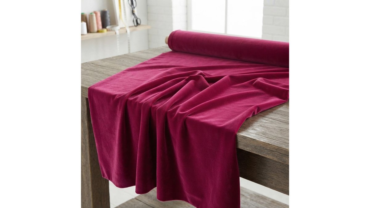
Velvet works for formal events because its pile catches light differently than flat fabrics.
Below, we cover the seven shades we expect to see most in 2026, the palettes that pair with each, and the practical limits most trend lists skip.
Jewel Tones Dominate Formal Event Décor
Jewel tones dominate 2026 formal décor because they hold depth under low light, where most formal events happen. Emerald, burgundy, and navy top the list, with purple close behind.
Emerald Green, Burgundy, and Navy
Emerald green is the defining velvet shade of the year for weddings and galas. It pairs cleanly with gold chargers, brass candlesticks, and white florals.

Burgundy remains the safest dramatic choice. It flatters candlelight, hides minor spills better than lighter shades, and works for fall and winter events alike.
Navy is the underrated pick. It photographs as near-black in dim rooms but shows its blue in daylight, making it flexible for venues with mixed lighting.
| Shade | Best Season | Pairs With | Lighting Note |
|---|---|---|---|
| Emerald green | Fall, winter | Gold, ivory, white florals | Deepens under warm light |
| Burgundy | Fall, winter | Champagne, brass, blush | Flatters candlelight |
| Navy | Year-round | Silver, white, greenery | Reads black in dim rooms |
| Purple | Winter, holiday | Silver, lavender, white | Best under cool light |
Purple and Red Velvet
Purple velvet splits into two directions this year. Deep plum and aubergine suit holiday décor and winter galas. Softer lavender velvet works for spring weddings that want romance without pastel sweetness.
Red velvet is the boldest option on this list. It suits holiday events, anniversary dinners, and any setting where the table should be the focal point. The risk is real: red velvet overwhelms a small room fast.
Best Tablecloth Colors for Weddings
The best tablecloth colors for weddings in 2026 are blush, champagne, and ivory, with jewel tones reserved for evening receptions. The choice comes down to time of day and formality.
Blush, Champagne, and Ivory
Blush velvet gives a romantic look without the sweetness of pink satin. It suits daytime ceremonies and garden venues.
Champagne is the most versatile wedding shade.
Ivory velvet is the formal classic. It shows every crumb and spill, so it suits plated dinners better than buffets.
For evening weddings, emerald and burgundy velvet tablecloths create a dramatic focal point that daytime pastels cannot match.
How to Choose Tablecloth Colors
Choosing tablecloth colors comes down to four variables: event formality, venue lighting, season, and the surface the cloth sits on. Most trend lists stop at formality, but lighting and surface are where velvet behaves differently from satin, taffeta, or polyester poplin, and the two most common reasons a shade that looked right in a showroom looks wrong on the night.
Match the Color to the Event Type and Formality
Start with formality, because it narrows the palette faster than anything else. A velvet tablecloth in emerald at a 10 a.m. brunch looks heavy; the same cloth at an 8 p.m. reception looks intentional. The pile reads as weight, and weight reads as evening.
- Black-tie gala: emerald, burgundy, navy, black, deep plum
- Evening wedding: jewel tones, champagne, aubergine
- Daytime wedding: blush, ivory, lavender, sky blue, sage
- Holiday event: red, plum, emerald, silver-gray
- Corporate formal: navy, charcoal, taupe, slate
- Anniversary or milestone dinner: burgundy, black, deep red
How Velvet Reads Under Each Lighting Type
This is the part most guides skip. Velvet absorbs light and returns it in soft gradients, so the same shade can shift two or three steps depending on the bulbs above it. A common pattern planners report:
| Lighting Type | Effect on Velvet | Shades That Hold Up | Shades That Fail |
|---|---|---|---|
| Warm incandescent (2700K) | Pushes reds and greens richer; yellows warm | Burgundy, emerald, plum, champagne | Cool grays, lavender, sky blue |
| Warm LED (2700-3000K) | Similar to incandescent but flatter; less shadow depth | Burgundy, navy, taupe | Pale pastels, silver-gray |
| Cool LED (4000-5000K) | Washes out deep shades; makes pastels look gray | Emerald, navy, ivory, blush | Burgundy, plum, warm reds |
| Daylight / tented (5000K+) | Truest color rendering; shows every flaw | Ivory, champagne, sage, blush | Black, deep navy (reads flat) |
| Candlelight / low ambient | Deepens everything; adds orange cast | Burgundy, emerald, plum, black | Pale pastels disappear |
| Uplighting (colored) | Tints the cloth toward the wash color | Neutral base cloths | Any shade that clashes with the wash |
A practical rule: if the venue uses cool LED, choose warmer shades like champagne, blush, or burgundy to compensate. If the venue uses warm bulbs, deep greens and plums gain depth. If the venue uses colored uplighting, choose a neutral velvet base and let the light do the color work.
Factor in the Table Surface and Room Size
Velvet over a bare wood table and velvet over a white banquet table read differently. A dark velvet cloth over a white table can show a pale rim at the edges if the drop is short.
Room size matters too. Deep shades, black, navy, burgundy, emerald, absorb light and make a large room feel intimate, which suits galas. In a small room, the same shades can make the space feel closed in.
Match the Season
Season is the last filter, not the first. Fall and winter events pull toward deep colors. Spring and summer events pull toward pastels and neutrals. If your event sits on a seasonal boundary, a late-September wedding, an early-March gala, let the venue lighting and formality decide, not the calendar.
Royal Velvet Fabric 58" Wide| New Creations Fabric & Foam Inc. →
Neutrals and Seasonal Colors for Formal Settings
Neutral velvet tablecloths carry more formal weight than most planners expect. Ivory, champagne, taupe, and gray velvet read as elegant rather than plain because the pile adds texture that flat neutrals lack. The 2026 shift is toward warmer neutrals, champagne, warm taupe, and soft ivory, over the cool grays of previous seasons.
The 2026 Neutral Palette and What Pairs With It
Neutrals are not a single choice. Each one pulls the rest of the table in a different direction, and the pairing is what makes the recommendation actionable.
| Velvet Shade | Napkin | Runner | Floral | Charger | Metallic Accent |
|---|---|---|---|---|---|
| Ivory | Sage or blush | Natural linen | White roses, eucalyptus | Gold | Brass or matte gold |
| Champagne | Dusty rose or taupe | Champagne satin | Cream roses, ranunculus | Gold or rose gold | Warm gold |
| Warm taupe | Chocolate or cream | Burlap or raw silk | Dried florals, pampas | Bronze | Antique bronze |
| Gray velvet | Charcoal or white | Silver satin | White blooms, greenery | Silver | Polished silver |
| Slate | Navy or ivory | Charcoal linen | White orchids | Silver or gunmetal | Brushed nickel |
Seasonal Palettes With Complete Pairings
Seasonal color selection follows a pattern, but the pattern only helps if you know what to pair with each shade.
Fall (September-November). Burgundy, emerald, and deep plum lead. Pair burgundy velvet with champagne napkins, a brass runner, blush and cream florals, and gold chargers.
Winter (December-February). Red, navy, silver-gray, and black lead.
Spring (March-May). Blush, lavender, sage, and sky blue lead.
Summer (June-August). Lighter jewel tones and pastels lead.
Holiday Décor as Its Own Category
Holiday décor is its own category, and it is where velvet earns its reputation. Deep red and plum velvet tablecloths paired with gold accents define the season, and they work for both formal dinners and corporate parties. The practical difference is that holiday tables often run under warm white string lights and candlelight, which push reds toward orange and deepen plums.
Why Neutrals Outperform Trend Shades Over Time
A neutral velvet tablecloth is reusable across event types, seasons, and lighting conditions in a way a trend shade is not. Champagne velvet works for a spring wedding, a fall corporate dinner, and a winter holiday party with only the accent colors changing. A burgundy velvet cloth is beautiful but reads as fall and winter only. For planners sourcing multiple events, the neutral base plus seasonal accents is the more economical and flexible approach.
Velvet Tablecloth Styling Ideas
Styling velvet tablecloths well comes down to contrast. Velvet is a rich texture, so the rest of the table should balance it rather than compete.
Coordinating Linens, Flowers, and Place Settings
Pair velvet tablecloths with smooth linens for contrast. A velvet cloth under satin napkins or a matte runner keeps the table from feeling flat.
Place settings should stay simple. Gold or silver chargers, crystal glassware, and minimal flatware let the cloth carry the visual weight.
A full velvet look works for galas. For smaller events, use velvet on the head table and a complementary neutral on guest tables.
Velvet vs. Satin Tablecloths
| Feature | Velvet | Satin |
|---|---|---|
| Surface | Matte with soft sheen | High gloss, reflective |
| Best for | Formal events, dramatic focal point | Weddings, lighter events |
| Drape | Heavy, full | Light, fluid |
| Care | Machine washable, spot clean | Hand wash or dry clean |
| Wrinkle resistance | High | Low, creases show |
Velvet wins on formality and hides wrinkles. Satin wins on shine and lighter handling. For black-tie events, velvet is the stronger choice.
Velvet does have practical limits. It attracts lint, is heavier to transport, and crushed velvet shows fold marks if stored poorly.
Formal event planning gets easier when the fabric is one decision you do not have to second-guess.
Frequently Asked Questions
What are the top velvet tablecloth color trends for 2026?
For 2026, jewel tones lead formal event décor: emerald green, burgundy, and navy velvet are the strongest choices, followed by deep purple and red. Soft neutrals like champagne, ivory, and blush remain popular for weddings, while pastel colors such as lavender and sky blue work well for spring and summer celebrations. The overall direction favors rich, saturated hues that photograph well under low, warm lighting.
What colors pair well with a velvet tablecloth?
Pair jewel-tone velvet with metallic accents: gold with emerald green or burgundy, silver with navy or purple. For neutrals, champagne and ivory velvet work with blush, taupe, or gray linens. Keep the tablecloth as the dramatic focal point and let napkins, chargers, and florals echo one or two complementary shades rather than competing with the velvet's rich texture.
Are dark or light tablecloths better for a formal dinner?
Dark velvet tablecloths in emerald, burgundy, or navy suit evening events and candlelit rooms because the deep color absorbs light and creates an intimate, luxurious mood. Light velvet in ivory, champagne, or blush works better for daytime weddings and bright venues, where it reflects light and keeps the table setting feeling open and elegant. Match the shade to the room's lighting, not just the season.
How do you coordinate velvet tablecloths with flowers and place settings?
Start with the velvet color, then pull one or two accent shades from it for flowers and place settings. A burgundy velvet cloth pairs with blush roses and gold chargers; emerald green works with white blooms and brass accents. Keep centerpieces low so guests can see across the table, and choose napkins in a lighter tone than the velvet so the place setting reads clearly against the rich fabric.